Portfolio: Alex Ogden
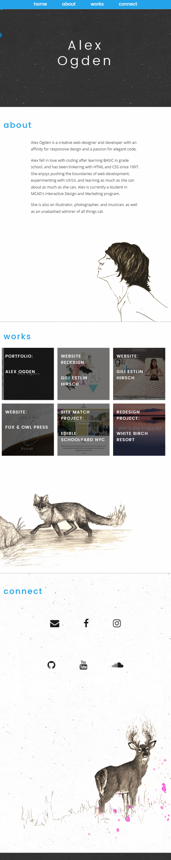
This was the final project for my Responsive Design course at MCAD during spring term 2017. The parameters of the assignment were open-ended; students had to create a fully-functional responsive website with multiple media queries, emphasizing a mobile first design. On the development side, the incorporation of SASS was required, and students had to post their progress on GitHub throughout the design and development process.
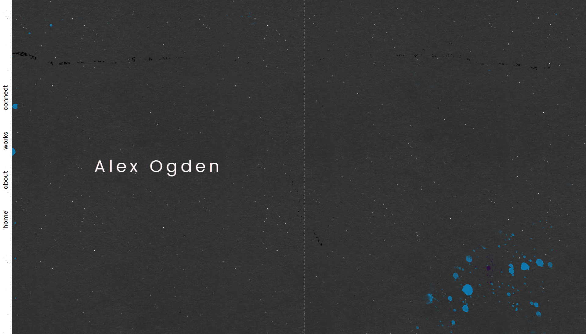
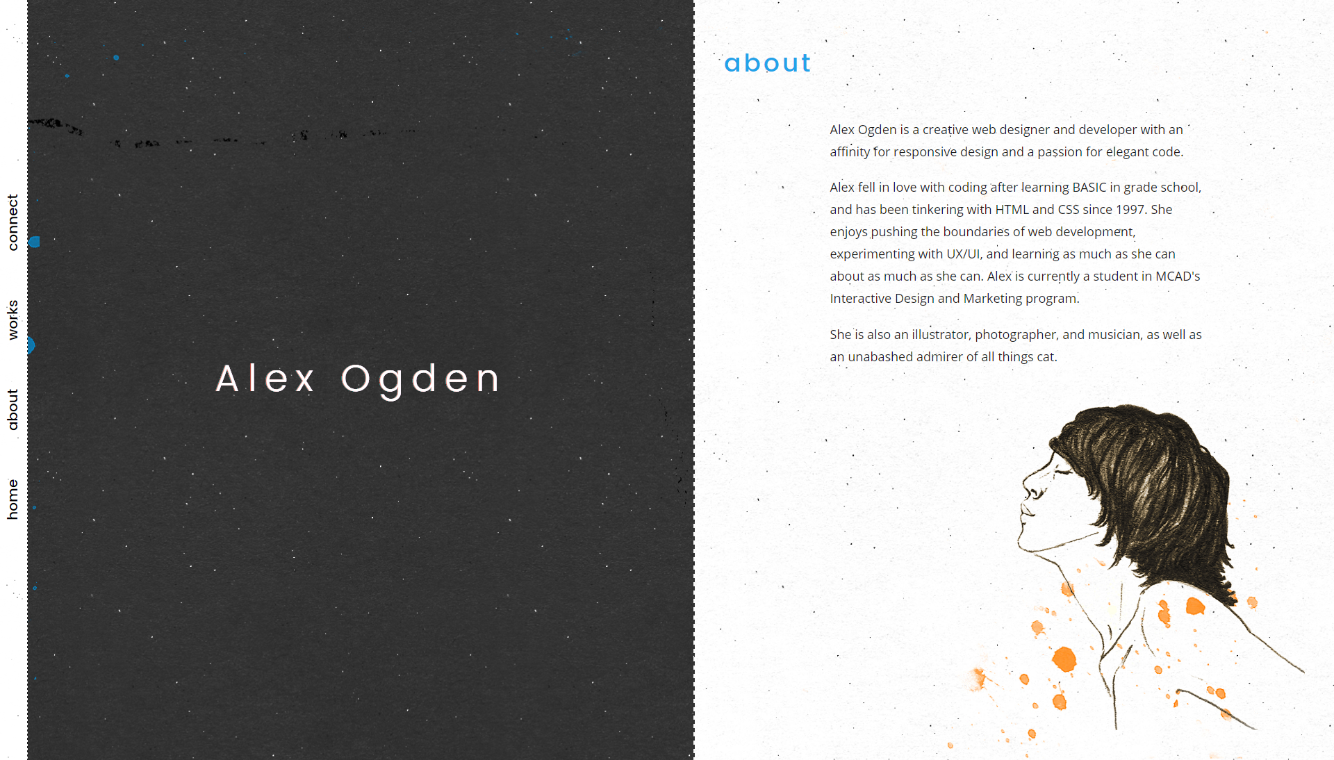
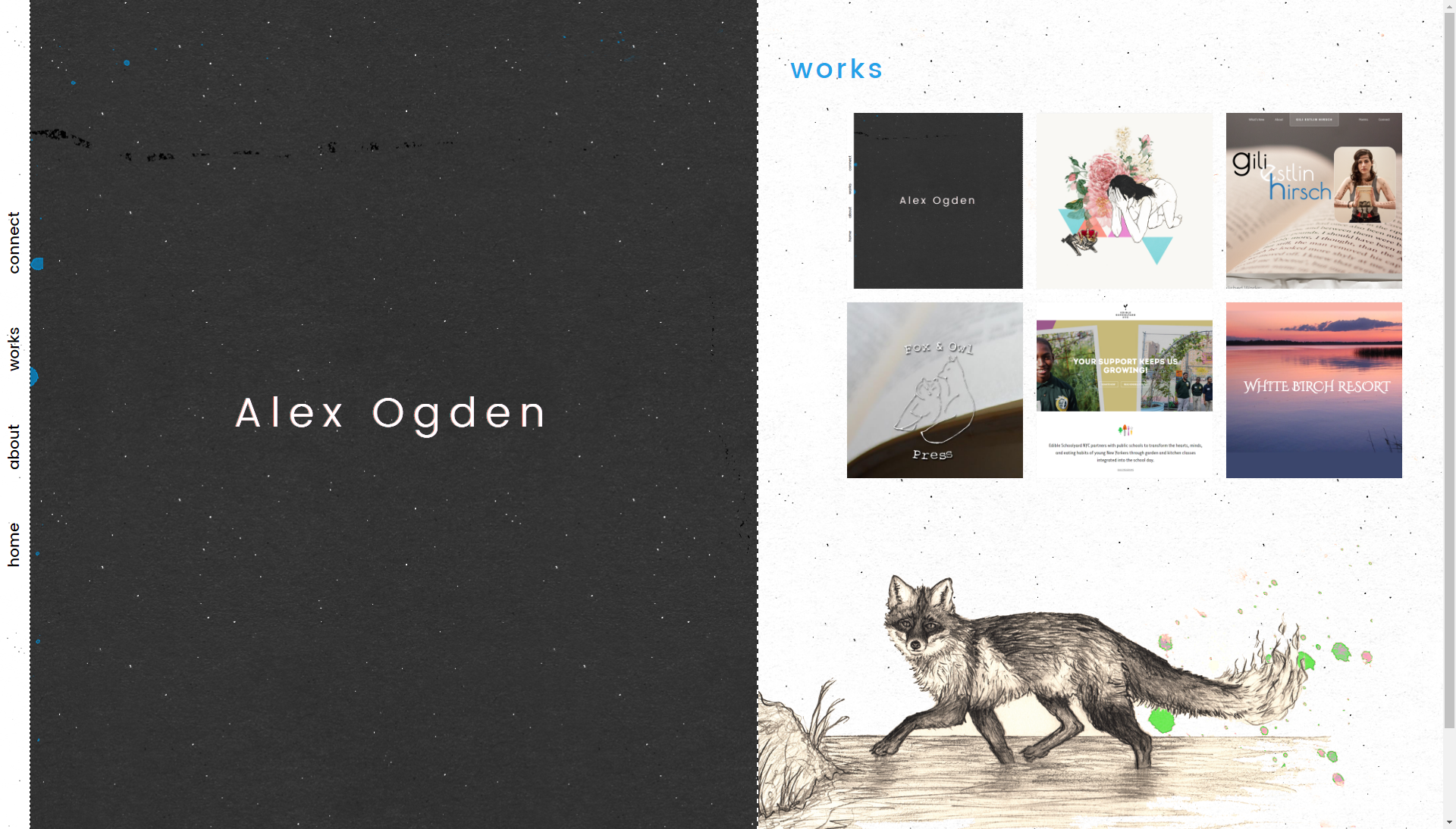
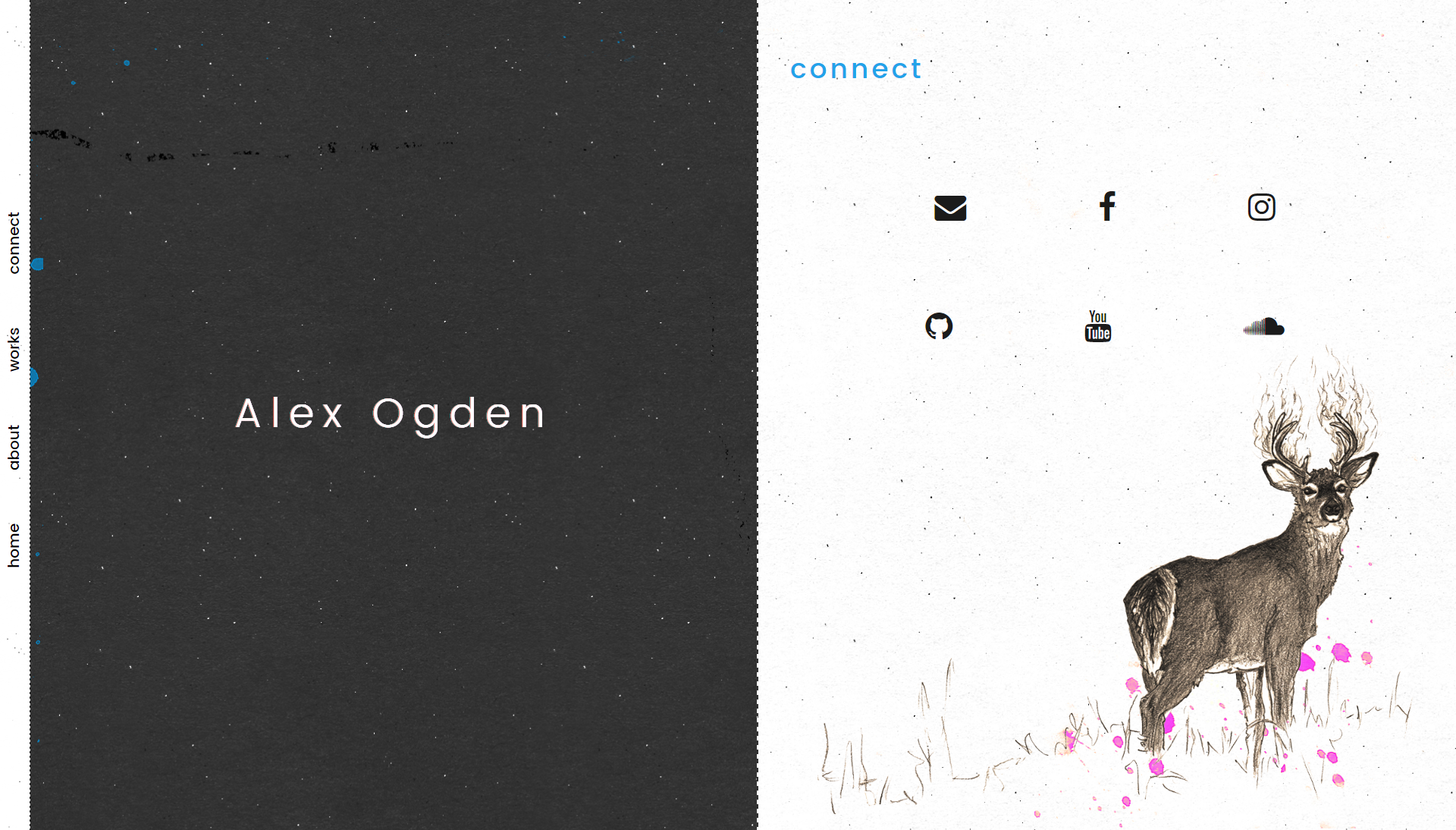
In the creation of my personal portfolio site, I wanted to stick to using only HTML, CSS, and SASS because I wanted to explore the capabilities of these languages to the fullest. I was specifically interested in applying CSS Grid elements to my site, which led to the refinement of the vertical split-screen design in the desktop view. Because of the amount of content on the site, using a split-screen design provides plenty of space for the viewer to read comfortably and navigate galleries with large images. I also experimented with a glitch effect via CSS on the home page, which, when clicked, reveals an animated gif that I created on the opposite side of the page. Another technique I incorporated into the design of this site is using CSS transitions to create an opacity fade-in effect.